Designer & Writer
"Art should be accessible
to everyone."
— Richard Bergh
Projects from an art, design and innovation lover
I work at the intersection of visual design and writing — crafting experiences, campaigns, and ideas that communicate with intention. Based in Stockholm.
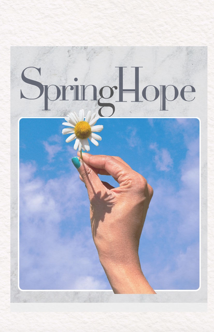
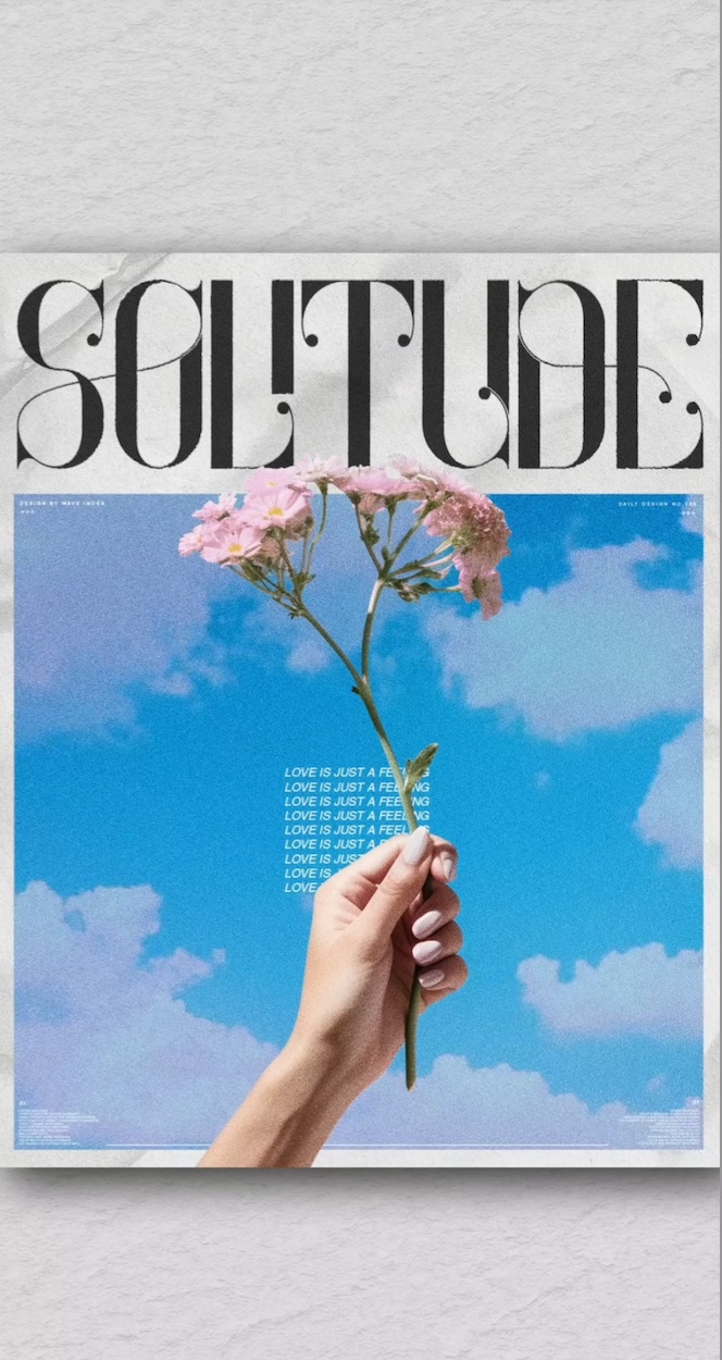
Recreating Inspirations
Found an Instagram magazine cover and recreated it from scratch — developing Adobe Suite skills through layered textures, marble typography, and editorial art direction.
↗
Perspectives
A personal opinion piece on how the lens you look through changes everything.
↗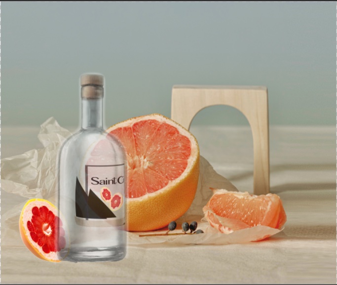
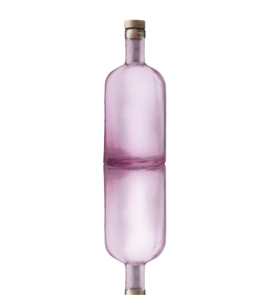
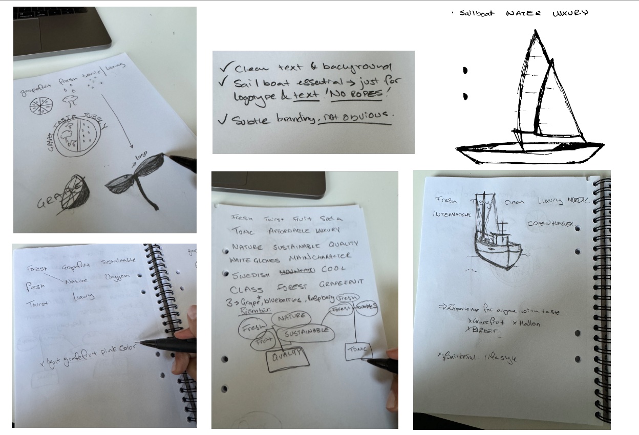
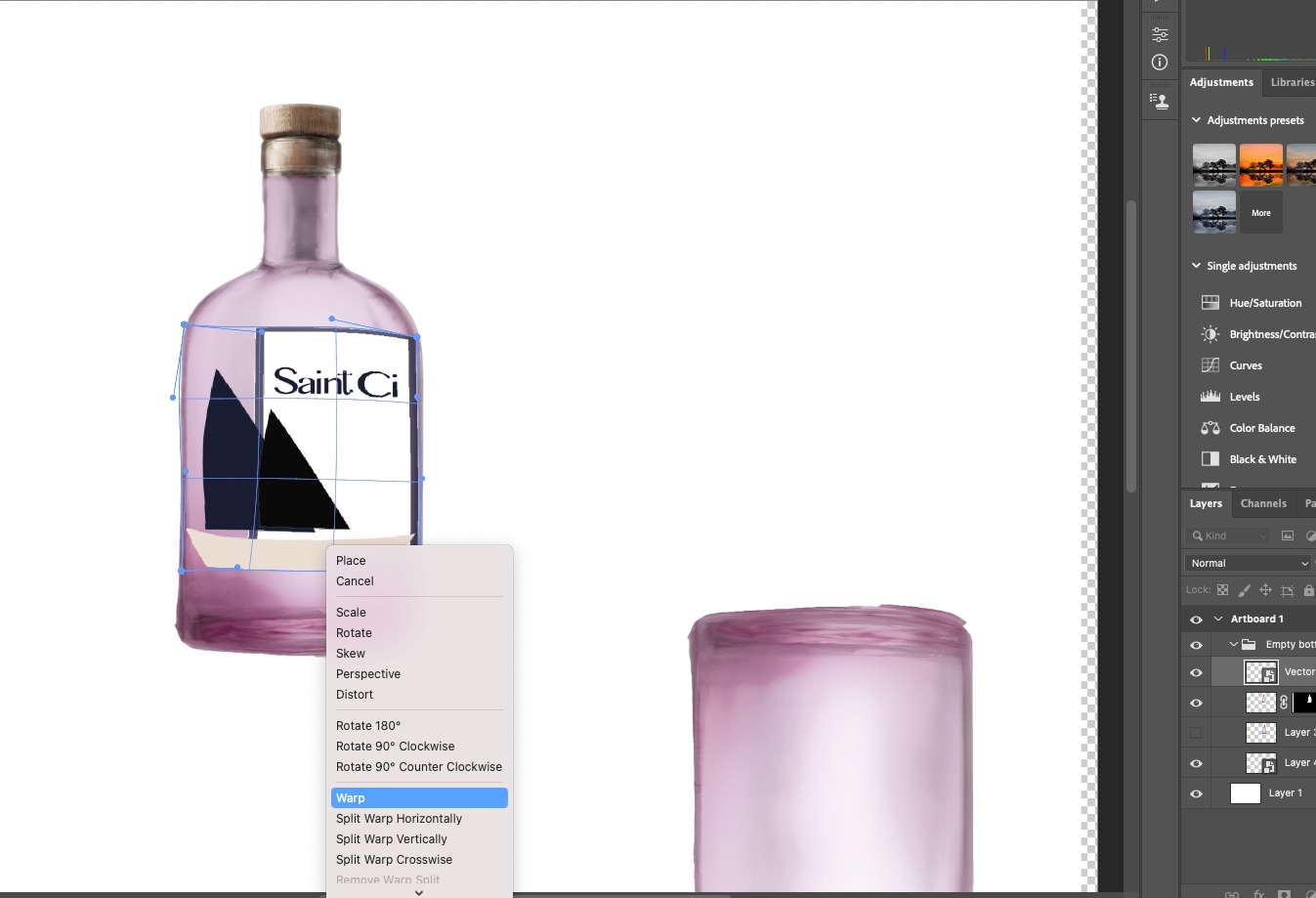
Beverage Brand Identity
Full brand identity for Saint Ci — a luxury Nordic soda. From branding map to bottle rendering, logotype, and final campaign mockup in Photoshop & Illustrator.
↗Inclusion in Art & Innovation
On why diversity of perspective isn't just ethical — it's what makes creative and tech industries stronger.
↗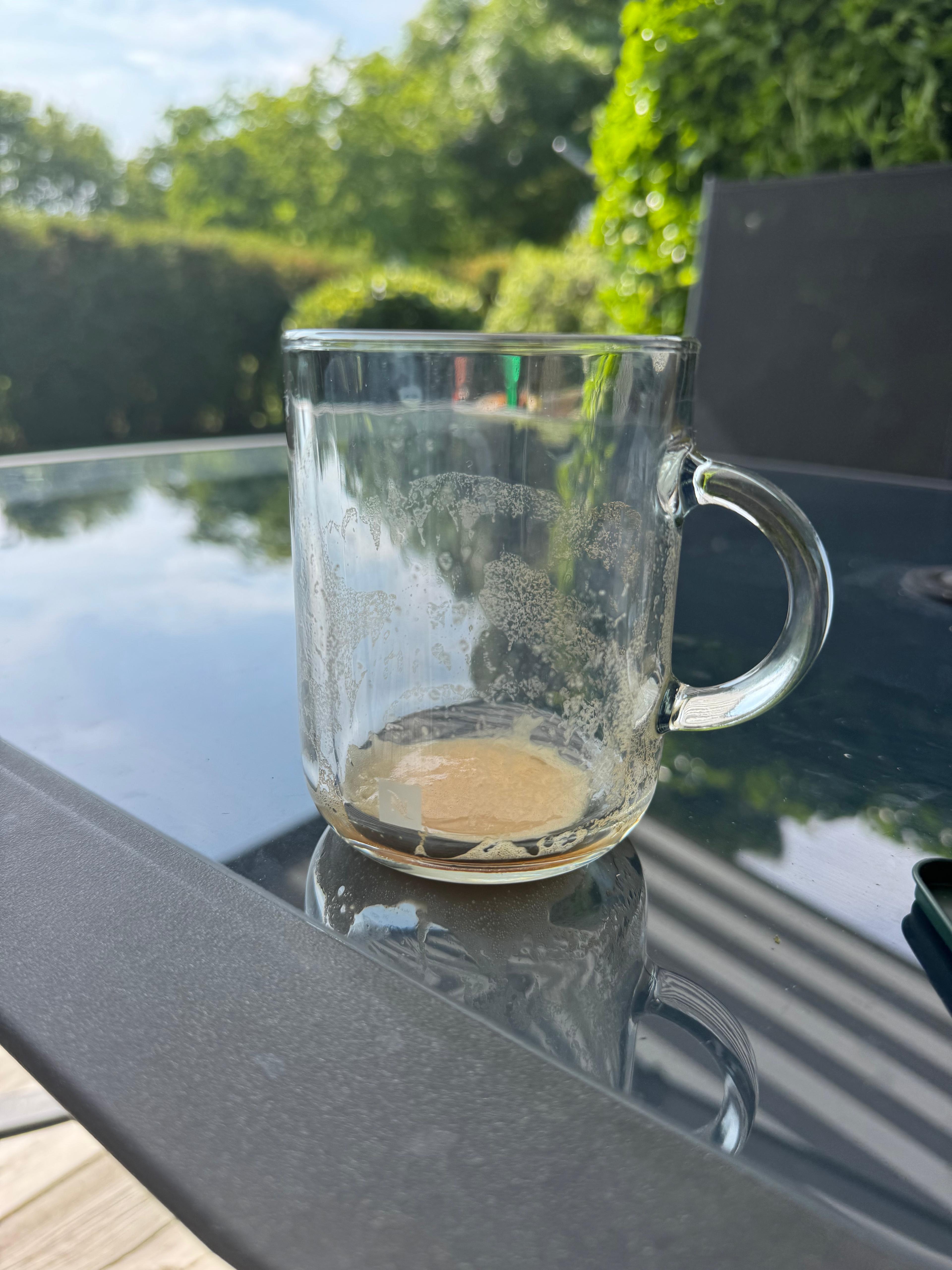
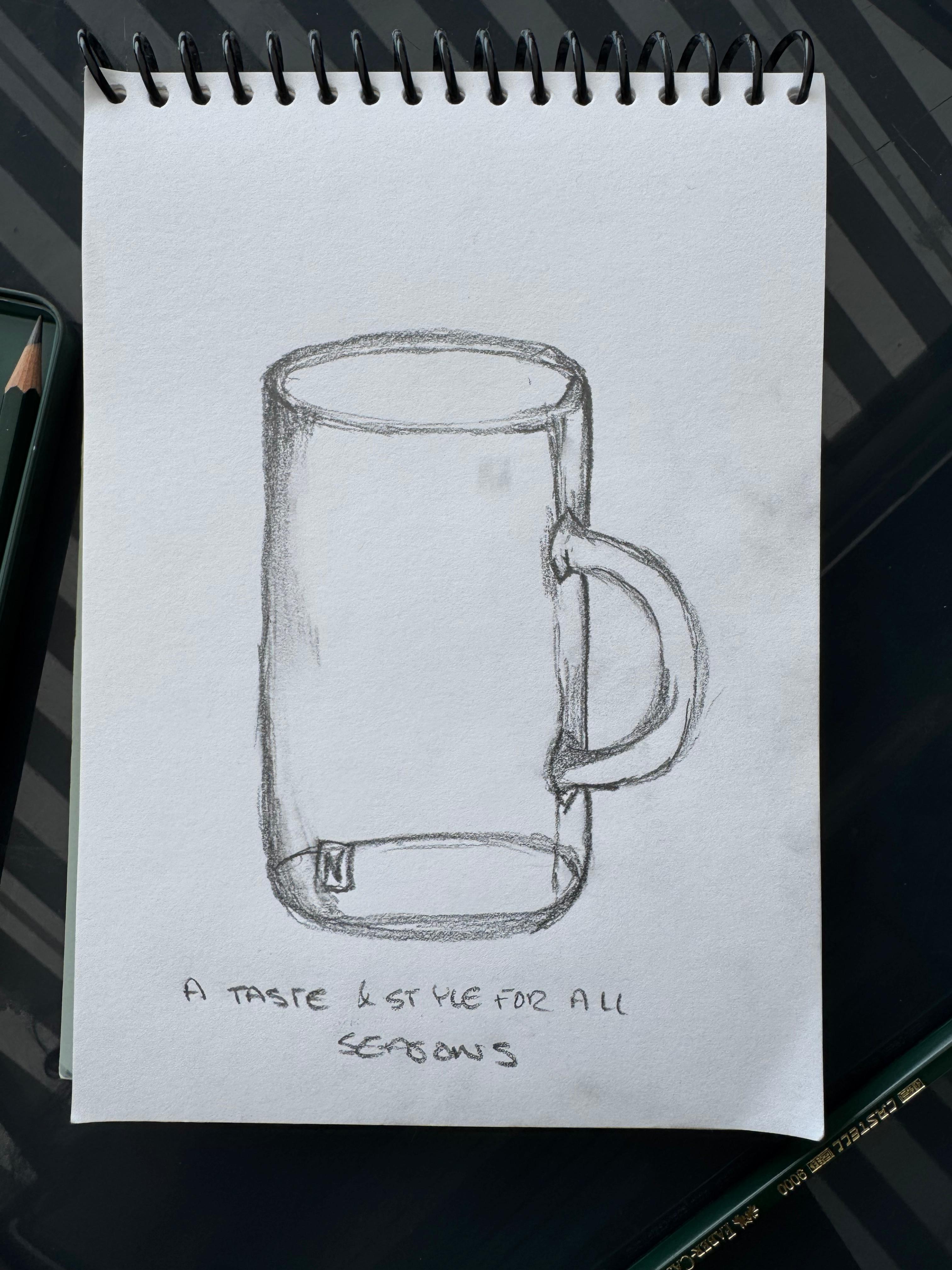
Nespresso
A taste & style for all seasons — a mug design and campaign concept exploring luxury in everyday moments, inspired by New York.
↗Svenska Turistföreningen — 360° Campaign
A full campaign brief from Berghs SOC: strategy, art direction, and copywriting with real client meetings, audience research, and concept development.
↗Nothing here yet — check back soon.